
Timeline: 1 Week• Materials: Sticky Notes, Index Cards, Pen, Paper, Google Forms, usabilitest.com
UX Techniques: Screener Surveys, Mind Mapping, Card Sorting(Open & Closed), SiteMaps , User Flows, User Personas, Heuristic Evaluation
Data is everywhere! Data is constantly being generated, collected and analyzed in order to inform and improve systems, services and processes. As UX specialists, data forms the core of our research. This may seem paradoxical, but the UX Specialist relies heavily on data to form insights on how to present data or information. One of the clearest examples of this is the UXer’s role in information Architect and website layout.
Background
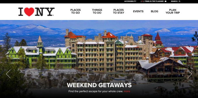
IloveNY.com is New York State’s official tourism site where visitors can explore all the state of New York has to offer including fun things to do, year-round events and festivals, world-class hotels and award-winning restaurants.
Task
Iloveny.com has hired my UX team at CodePro.co to assess their desktop website. As part of that assessment, the deliverables listed below will be presented along with our team’s recommendations.
Deliverables:
- Heuristic Evaluation
- SiteMap (Original & Revised)
- Card Sorting Documentation
- User Flow
The User — Sam

Heuristics
To begin this project, we completed a heuristic evaluation of the current website. A heuristic evaluation is a way to test whether a website is user friendly. This evaluation is based on a set of predetermined heuristics or qualitative guidelines. There are several methods commonly used and accepted for heuristic evaluation in UX. These include the “Jacob Nielsen’s 10 Usability Heuristics for User Interface Design,” and the “Abby Method” among others. For this project, my team decided to employ the Abby method which evaluates websites on the following criteria:
- Findable: Can users easily locate the things they are seeking?
- Accessible: Can content and features be accessed via all expected channels and devices when needed?
- Clear: Is it easy to understand (including uncommon terms or being
purposefully unclear in language)? - Communicative: Is the system status and location of the user obvious?
- Usable: Are users able to complete their tasks without major blockers?
- Credibility: Is the design appropriate to the context of use and audience?
- Controllable: How well are errors anticipated and eliminated?
- Valuable: Is this product desirable to the target user?
- Learnable: Can it be grasped quickly?
- Delightful: How are user expectations not just met but exceeded?

What was learned?
After completing the heuristic evaluation, which was completed using Google sheets, my team found a few issues with the user experience on the iloveNy.com website, most notably the relatively long loading times(Usability) of the “Places to go” and “Places to stay” webpages. Furthermore, these pages, which both feature filters which default to display all results, do not allow users to search by common search parameters, especially distance. Furthermore, if users input incorrect information, the process of correcting this error was delayed due to the long loading times and numerous Javascript that were running on the page(Controllability). This exercise really helped our team revamp our mindset to think like the user of the website, anticipating how they will maneuver and interact with the website to gain the information that they need to plan a trip.
Site Map (Original)

Sitemaps are a hierarchical diagram which show the structure of a website. They are commonly used by User Experience Designers and Information Architects to define the taxonomy through grouping of related content. Sitemaps are extremely important to the user experience because they help ensure that information is presented in a manner that is consistent with user expectations. That is, when a users visits a website, can they easily navigate it and obtain the information that they need. To create our sitemaps, our team used Flow Mapp (https://flowmapp.com/).
Card Sorting
Open Card Sort

Open card sort is a UX technique where participants are provided with a group of cards, usually on a physical or digital card, with each card containing one item of content or functionality written upon it. Each content or functionality is derived from the website which is under the process of research. The participants are then invited to arrange, organize or sort the content into groups, and come up with a name for the groups. This technique is typically used to generate ideas for taxonomies.
Closed Card Sort

Unlike the Open Card Sort, in the closed card sort, participants are provided with the list of cards and content as well as the labels of all possible groupings. Participants are then tasked with arrange the cards into the groups as they would expect it. This technique is typically used to evaluate a taxonomy, or system of classification that you have come up with.
What was learned?
Observations: Results from the open and closed sort exercises with 5 respondents each, were extremely varied. The only substantial patterns observed were major groupings similar to those that presently exist on the IloveNY.com website. The largest source of confusion was around the area location names. Respondents placed these locations in categories such as “location”, “region”, “places to go”, or “mountains”. Users were also confused about where to place cards such as “History” or “Nature.”
Insights: Depending on how familiar users were with NY demographics, they interpreted Regions or locations in NY as Mountains or Regions. Furthermore, The grouping of “Plan Your Trip” cards were widely dispersed, depending on how the user felt they should be group based on past experiences based on exit interview questions. Users wanted access to more planning resources here.
Recommendations: Because many who visit the state might not be aware of regional areas, this should be clearly labeled as “Regions” so that users do not confuse regions that have names that correspond to mountain ranges. Furthermore, Items listed as under the “Plan your trip” navigation should be listed as “Resources” to be clear that those are resources available for trip planning and contact. Lastly, cards with duplicate names but unique content such as “history” and “nature” should be clearly labeled differently. For example, “History” under the “Events” nav should be listed as “NY Historical Events.”
Site Map (Revised)
With the insights gained from the card sorting exercise, my team and I were able to compose a set of recommendations that would help improve the user experience on the IloveNY.com website. This exercise taught our team that even simple adjustments can have a major impact on the user experience when those adjustments are data driven and help align the information structure with the user’s expectations.

User Flow
A flow is a diagram that is used to visualize a user movement through a set of processes or screens. For this project, we decided to use a User flow which is used to clearly and concisely communicate behavior to developers, QA, and other stakeholders. For this reason, User Flows are generally staged with a Scenario and Specific task that should be completed. You can see the scenario and task used in this project below. The user flow reinforced the importance of keeping the user at the center of the entire process. It allowed us to see a typical case of how our user might utilize the website.

Revised Website Mockup

Next Steps
Complete card sort with new navigation system.
Iterate
Handoff to developers