
Timeline: 2 Weeks • Materials: Sticky Notes, Pen, Paper, Sketch, Invision, Figma
UX Techniques: Business Analysis, User Interviews, Screener, Surveys, Secondary Research, Mind Mapping, Affinity Mapping, User Flows, User Personas, Sketching, Wireframing, Prototyping, Usability Testing
Task
VolunteerMatch is non-profit organization that matches inspiring people with inspiring causes. My team at General Assembly UX was recently contracted by the executives at VolunteerMatch to resolve any usability issues on their responsive website (VolunteerMatch.org).

Process Overview
We divided this task into two general sections — Research & Design, and repeated their respective deliverables & tasks multiple times with each iteration increasing in fidelity.
Research — Deliverables & Tasks:
- Screener Surveys
- User Interviews
- Research Synthesis
- Persona
- Problem Statement
- Usability Testing
Design — Deliverables & Tasks:
- Design Studio(Pitch and Critique)
- Mid-Fidelity Wireframes with Annotations
- High Fidelity Prototype
- Clickable Prototype(Mid and High Fidelity)
Understanding Our User
In order to begin the process of understanding who our user is, we decided to develop and deploy a screener survey with the goal of identifying respondents who have either volunteered within the past three years, or those that are interested in volunteering within the next 12 months. Furthermore, due to time constraints, we were interested in individuals who were open to completing a more in depth user interview within the following two days. In developing the questions for the screener survey, we used a UX technique called mind-mapping which is utilized to help organize a collection of information around a single topic. We wanted to ask broad, generalized questions to cast the widest net for qualifying respondents. Our efforts yielded a total of 38 respondents of which 8 fully qualified to move on to the user interview phase.
Much like the process for developing our screener survey questions, we began the process of developing questions for our User Interviews with a session of mind-mapping. However, unlike the generalized questions of the screener survey, we wanted to ask open-ended and specific volunteer-related questions that helped us understand how users navigated the volunteering process from start to finish. Our questions prompted users to think about specific volunteering engagements by detailing how they learned of the opportunity, signed-up and participated. Questions like “Tell me about your last volunteer experience” or “Tell me about your experience on the site,” provided robust information that will be detailed in other parts of this case study. Of interest during this phase were users who utilized an electronic device at any point of the volunteering process.
Research Synthesis

Our user interviews yielded a tremendous amount of information and we were tasked with making sense of it. To begin this process, we employed a technique used in many industries including UX called Affinity Mapping. Affinity mapping is a process where UX researchers transcribe observations, in our case, observations from our user interviews, unto post-its. These observations are then grouped and re-grouped until trends, themes and patterns begin to emerge. Our affinity mapping revealed several insightful take-aways that we utilized in developing our user persona, user journey and problem statement.
Research Synthesis — Insights
- Users liked having options to search by time and location location.
- Users wanted to volunteer in the communities where they lived.
- Users wanted an all-in-one solution. They did not like to have to utilize several websites or apps just to complete one volunteer engagement.
Bryn — The User
The insights gained from our user interviews and affinity mapping process were used to create a persona named Bryn. Personas represent a user type that might use a site, brand, service, or product and are critical in the UX design process. Personas help facilitate the process of thinking and designing from the standpoint of our users, in this case, Bryn. Bryn, a 33 year old teacher from Grune Texas loves animals and giving back to her community. With limited free time and transportation options, she needs to be able to quickly find a volunteering opportunity that’s near to her home, fits her schedule and if possible involves tutoring children.

Bryn’s Journey
According to the Nielsen Norman Group, a journey map is a “visualization of the process that a person goes through in order to accomplish a goal.” For this task we will utilize our newly created persona Bryn. Bryn want’s to plan a volunteer experience that incorporates her love of animals. As noted in the journey map below, Bryn eventually lands on the NY cares website and is happy with the clear options she finds on the website. However, she is quickly overwhelmed by the sheer amount of information that soon has her lost in a complicated maze of navigating what appears to be an unlimited supply filter options. Ever determined to succeed, Bryn undauntedly makes a selection and eventually carries out the volunteer opportunity.

The journey map allowed us to clearly see Bryn’s highs and lows throughout her experience. Furthermore, it aided us in qualifying areas of opportunity — specifically in regards to adding a date/time filter early on in the volunteer engagement search process and the importance of a decluttered user interface.
State the Problem
Armed with our Persona and her journey map, we were ready to clearly define a problem statement for our user Bryn. According to the Interaction Design Foundation, the problem statement is an integral part of the design thinking process which the design thinker will focus on solving. They suggest that a problem statement be human-centered, broad enough for creative freedom and narrow enough for manageability. The problem statement we developed is as follows:
Insight: Giving back to their local community by volunteering and
outreach is important to many people.
User + Problem: Bryn loves to organize volunteer events for herself & her
community, but has limited free time in her busy
schedule.
Opportunity: “How might we help Bryn quickly find desired
volunteering opportunities that fit her busy schedule?”
Testing the current website
Before we begin our design studio, we need to test the current website with at least one round of usability testing. This provides us with further insights on things that are working well with the current set-up and things that can be improved. We tested the VolunteerMatch.org website with 5 users. All users were tasked with 1) locating available volunteering opportunities in their hometown and 2) register interest for a volunteer opportunity that involved tutoring. 5/5 users were able to complete both tasks albeit with a few hiccups. For task 1, 4/5 users were hesitant about providing their contact information without any confidence that the website would be to assist them. 2/5 users were not able to locate their specific neighborhood having to utilize a neighboring community. 1/5 users skipped the location search completely, opting to utilize several layers of filters. For task 2, 2/5 users had to copy and paste links in order to learn more about a volunteer opportunity and 2/5 left a rather generic message for the organization.
Under Construction
After all of our research, synthesis and usability testing, there were several area of opportunity for improving the VolunteeringMatch.org experience. We decided to focus on two aspects of this experience:
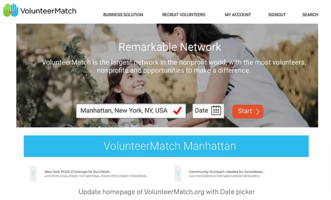
- Adding a date selector to the home page as many users wanted the ability to search for volunteer engagements by location and date.
- Improving the “I want to help” user experience by combining this screen with the Log in/ Sign up aspect of the volunteering process as well as by providing users with an opportunity to submit meaningful data to the partner organization.
Design Studio
One of the most interesting parts of the process was the Design Studio. Here my team and I finally started the design process where we would individually sketch solutions, share our designs, receive feedback, consolidate, then rinse and repeat. Each phase had clearly defined tasks and it was interesting to see some of the ideas that we came up with. Designed to be quick, cheap and though provoking, this process helped us to think like the user of the website. The feedback and critique rounds ensured that we maintained that focus on the user. After several iterations of this process, we had two final paper sketches of the improvements we wanted to implement on the desktop version of the VolunteerMatch.org website.


Mid Fidelity Wireframes
The mid fidelity wireframes provided us with a chance to see our changes in action in a format that represents a usable website. We got a contextual feel of how elements interacted with each other as well as the layout and fit. We then turned the wireframes into a clickable prototype which brought a level of interactivity which undoubtedly brought our changes to life. Owing to the fact that we were redesigning this responsive website for the user, we decided to conduct one round of usability testing with the clickable mid-fidelity prototype.


The insights grained from this round of usability testing surprised us. Despite implementing ways that users could communicate more effectively with partner organizations via the “I want to help feature,” 2/5 users did not utilize them, instead opting to just submit a blank form. Furthermore, on the homepage 1/5 users tested did not want to enter a date and could not proceed in completing the task. To this end, we knew that we had to address both of these issues in our Hi-Fidelity Click Through prototype.
Hi-Fidelity Click-Through
To address the issues discovered during the usability testing round done on our Mid-Fidelity Clickable Prototype, we decided to implement error messages and validations to alert and prevent users from submitting blank interest forms. We also made the selection of a date on the homepage completely optional which is inline with our initial goal of delaying the require sign in/sign up screen until the user was confident that the website could help them. Designing the Hi-Fidelity Prototype was challenging as we had to stay true to the design, look, feel and branding of the organization while implementing features to improve the user experience. This was only my second time designing in Figma, but the experience was a rewarding one that allowed me to grow as a UX Designer.
We completed this iteration round by conducting another usability test, again testing 5 users. All 5 users were able to locate tutoring opportunities in their local communities and express interest to the partner organization. Users remarked at how “straightforward” and “intuitive” the High Fidelity prototype was to navigate.

Secondary Breakpoint
With the desktop version flow developed, we turned our sights towards the mobile version of the website. Because we wanted to maintain as many features from the desktop version on the mobile version as possible, we had to free up prime real estate. To do this, we simply removed some text from the hero banner on the homepage without losing the essence of the original message. We also moved the “cause area” selection from a pop-up on the homepage, to a selection filter on the opportunities listing page. These minor changes allowed the responsive mobile version of the VolunteerMatch.org website to remain true to the desktop version. This project has taught me a great deal about research practices in UX and just how important it is to always keep the user in mind. It also taught me that responsive design doesn’t necessarily mean a complete redesign per device/platform, but rather how to extend continuity of brand, message and ease of use for the user.


Next Steps
- Further rounds of Usability Testings
- Iterate
- More Usability Testing
- Handoff!