
Timeline: 2 Weeks• Materials: Sticky Notes, Index Cards, Pen, Paper, Google Forms, iPad Pro, Figma, Sketch
UX Techniques: Screener Surveys, Mind Mapping, User Personas, Journey Mapping, Agile Project Management, Design Studio, Design Pin-up, UX Design Crit, Internal Stakeholder Presentation.
Background
As the United States moves closer to Universal Health Care, more Americans are being covered by health insurance than ever before. To ensure profitability, insurance companies are exploring ways to lower costs. Chief among these methods is by providing outpatient services such as rehabilitation as a first line of treatment rather than surgery. According to the Bureau of Labor Statistics, there are over 240,000 registered Physical Therapist in the United States in 2018, with a projected growth rate of 22% over the next ten years¹. While the number of Physical Therapists(PT) and their patient’s continues to increase, studied conducted by the National Institute of health(NIH) have found that as little as 35% of patients actually followed through with their PT regimen².
The Challenge(Fictitious Scenario)
My team at CodePro.co was hired by the NIH to explore ways that technology could be used to increase access to quality healthcare. Furthermore, we were tasked with partnering with an existing company in order to take advantage of possible operating synergies. After extensive research, my team at CodePro decided to focus on the Physical Therapy space because of its explosive projected growth and its relatively low utilization rate as reported by the NIH study².
User Interviews
My team at CodePro.co started the process by mind mapping the types of questions that we wanted to ask potential users of our app. Our mind mapping and brainstorming sessions led us to developing a simple 5 question screener survey which qualified respondents who have completed physical therapy within the past five years. We wanted a wide array of ages and demographics.
Our screener survey qualified 6 respondents with the following demographics:
- Gender: 5 women, 1 man
- Age: 25–72
- Chronic pain related PT: 3
- Injury related PT: 3
- Frequency: 1–3 times/week for 1–6 months
Affinity Mapping

What was Learned?
After completing the user interviews with the 6 respondents who had qualified, we placed data points from each interview on colorful post-its with each color representing a different user. We then synthesized and arranged these post-its into groups that represented valuable insights. The general insight that we learned from our affinity mapping process was that patients were relatively happy with the Physical Therapy process in the clinic setting, however, when they were home, the found it difficult to recreate the exercises and to contact their Physical Therapist.

User Persona
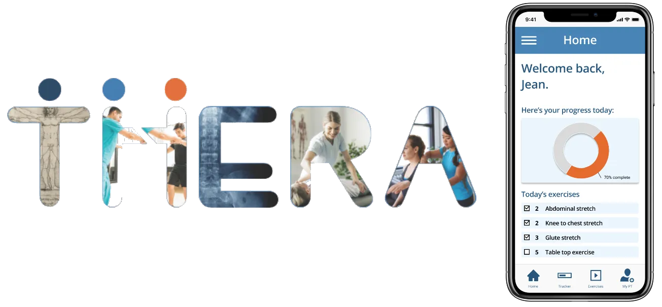
Our affinity mapping process provided us with a tremendous amount of insights that we were then able to utilize to build our persona Jean. A persona is a fictitious representation of the typical user of our application. In keeping with the data collected during our user research phase, Jean, a recently injured construction worker is in need of a great physical therapist who will be able to keep her on track with the regimens both in office and at home.

Jean’s Journey
To help us better understand how Jean maneuvers the Physical Therapy treatment process, we created a user journey map which allows us to walk through a typical scenario. In our journey map for jean, we can see her high and low points throughout the journey. In this journey map, Jean’s lowest points are found during the home experience and this is what we decided to focus on improving in our app. This led us to building out a problem statement which is a focused statement on how we will be able to specifically help Jean.

What’s the Problem?
Physical therapy patients often struggle to complete their prescribed regimen at home.
Jean recently injured herself at work. At the clinic, the physical therapist gives her clear instructions and support. However, at home, she is unsure of what to do when performing the prescribed regimen.
How might we provide Jean additional resources she needs to complete her at-home regimen successfully and track her progress?
Competitive Comparator Analysis
To get a sense of how we could structure our app and to see what features were already widely available and how they were used, we decided to complete a competitive analysis of existing apps on the market. We tested three apps that had similar features to those of the proposed Thera app, these include Medbridge Go for Patients, Physera, and Kaia. Furthermore, we tested a comparator app — an app that does not compete in the Physical Therapy space, but does utilize the same user pool. We found ranked the apps on 10 features and this allowed us to see exactly how Thera would fit in within the marketspace.

Medbridge Go for Patients is a PT involved app where patients must involve their PT in order to utilize the app. However, the app lacks personalization and enhanced communication features and essentially functions as a low level tracker application.
Physera is a PT optional app that has many of the same features as Thera but it lacks any personalization. The app has a robust knowledge-base that is populated with generic workout videos. Furthermore, there is no option to locate a PT in case the user does not already have one.
Kaia is a user based app that serves as a general repository for exercises for the lower back only.

Our Platform and Partner Selection

Design Studio
My team really enjoys the Design Studio process because it’s the first opportunity we have to see our ideas begin to take shape in a tangible way. We enjoy the impulsiveness and the constructive feedback as we all work towards a feature build out of the app that succinctly addresses the users needs and wants. For this design studio, we focused on three features:
- Progress Tracker
- Video Chat Feature
- Personalized Exercise Videos


Mid Fidelity Wireframes
The mid fidelity wireframes provided us with a chance to see our changes in action in a format that represents a usable website. We got a contextual feel of how elements interact with each other as well as the layout and fit. We then turned the wireframes into a clickable prototype which brought a level of interactivity which undoubtedly brought our changes to life. The annotations listed below details the positioning of various elements and their designed function.


Mid Fidelity Usability Testing
Since UX is all about research from the standpoint of the user, we needed to test our design with actual users. This would provide us with quality insight as to how users were actually using the features of the app. The results of two rounds of usability testing are listed below.


The insights grained from this round of usability testing were indeed interesting. We identified three major issues. The first being that some users users had problems with the onboarding screen, a screen designed to convey information. Some users felt that this screen should have some functionality due to the icons being incased in a solid-filled circle. To remedy this, we removed this background from the icons to clearly display that this screen was informative in nature without any functionality.
The second issue we discovered revolved around findability, that is are users able to find things where they would reasonably expect them to be located. In our first task, users were tasked with locating the exercise videos that they had filmed in the clinic with their PT. Once user felt that because this was done with the PT, that those videos should be located in the MyPT section of the app. To remedy this, we changed the icons of the exercises from an exercise icon to the universally accepted video icon. This allows for clear identification of where exercise videos are located in the app.
The third issue didn’t prevent our users from completing the assigned tasks, however several users did mention the fact that the were not exactly clear what information the tracker on the home screen was tracking. To remedy this, we changed the design of the tracker from bars to a circle that will fill in as the app is loading. This redesign will clearly convey to the user what percentage of the exercise regimen has been completed.


Hi Fidelity Clickable Prototype

Possible Next Steps
- Conduct usability testing for the high-fidelity prototype
- Edit the prototype based on feedback from usability testing
- Build out connection with partner company WebPT
- Hand off to developers
Addendum
Spec Documentation for Developers